Client: RIPE NCC
Scribble Delivered: brochure design, identity system, icon design, print & prepress
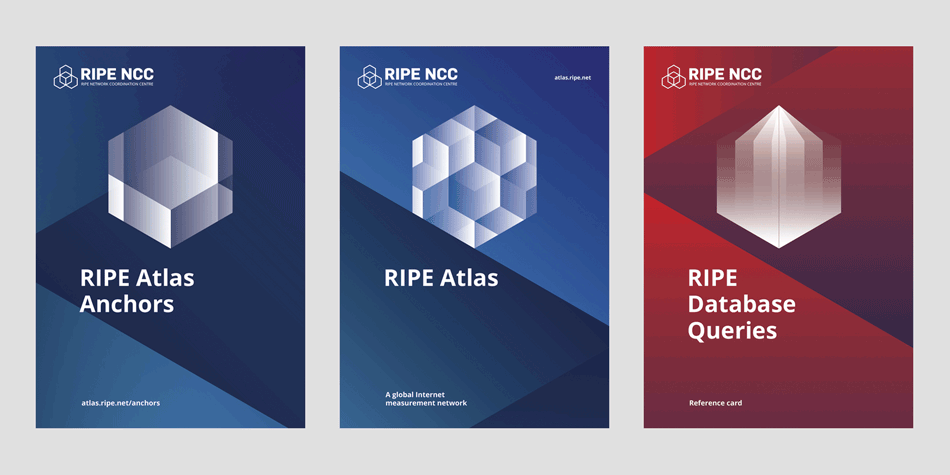
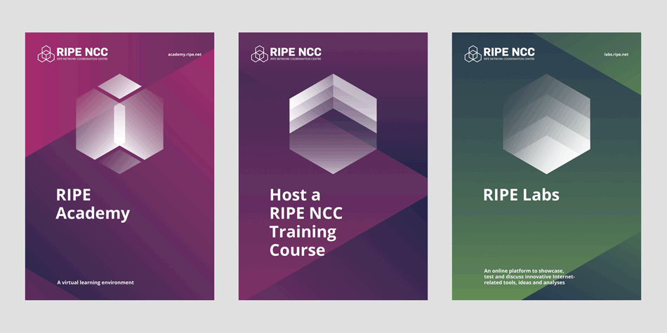
RIPE NCC is a non-profit organisation which is committed to fostering a . Scribble was hired to help the in-house team and come up with a overall look for the brochure/flyers line that they have.
As the content of the organisation is very technical and difficult to clearly visualise, the idea was to create a serie of abstract icons within the hexagon shape of the new logo. Overlapping elements create multiple shapes and dynamic textures, giving each brochure a unique look and reflecting the diversity of the community involved in the organisation.
Gradient backgrounds link brochures within the same subject matter and create a consistent look & feel throughout all brochures.


