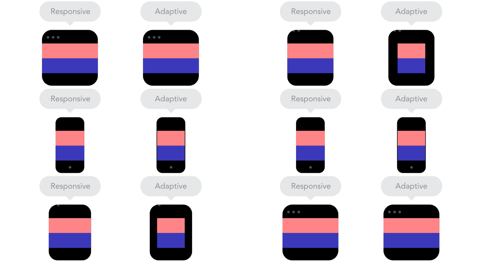
What is a responsive website? And all those other terms, what do they mean? Here is a fabulous article that will tell you all about it.
I worked on a logo and icon for an Elsevier brand called MethodsX which came alive in a really nice animation to explain what MethodsX is. Animation done by in60seconds.
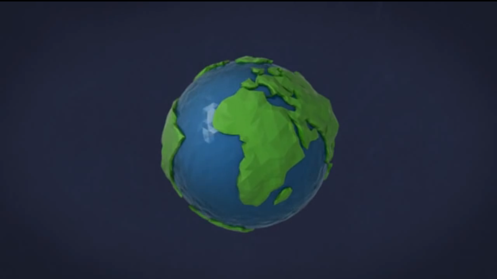
Great animation to introduce an interesting project. I wish internet for everyone, just like I wish food, health, education and all those other things but somehow these kind of projects by these type of giant corporations make me nervous instead of hopeful.

Philips recent refresh of its logo is among the most succesful logo redesigns of 2013 and I can’t agree more. The subtle adjustments in the stars and the simplifying of the waves make the receognizability easier when the logo is used small. Using the reversed version of white on a blue shield gives it a more modern feel. Pretty clever for a logo that saw the light late 1930s in the current setup. Read the whole article about most succesful logo designs of 2013 here.
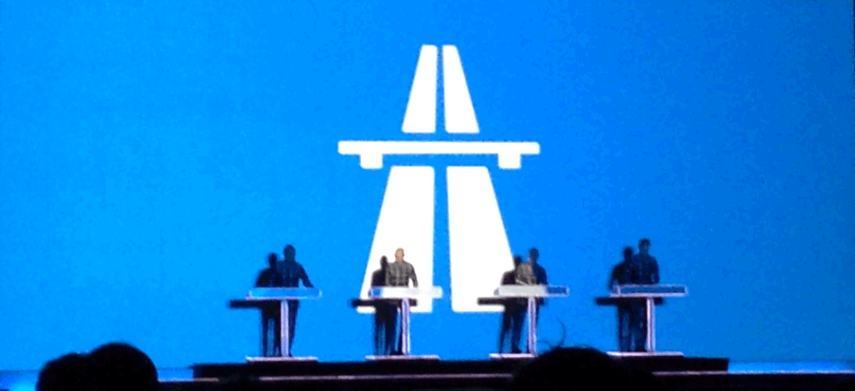
A live gig by Kraftwerk, a remarkable experience. They don’t move, they don’t talk and I even wonder what is done live, still Kraftwerk keeps your attention throughout a gig. Strong bold graphics, 3D elements, they still seem ahead of most bands out there. Even the minimal lyrics they have are still relevant, you just add something to a song like Radioactivität and it seems as you’ve created the song yesterday. “Tschernobyl, Harrisburgh, Sellafield, Hiroshima, Fukoshima, Stopt Radioaktivitat, Weil ‘s um unsere Zukunft geht”. Indeed, the future, lets hope they don’t have to adjust these lyrics again but Kraftwerk in the 70s or in 2013, I’ve never seen such a timeless brand and band.


